British Museum Great Russell Street
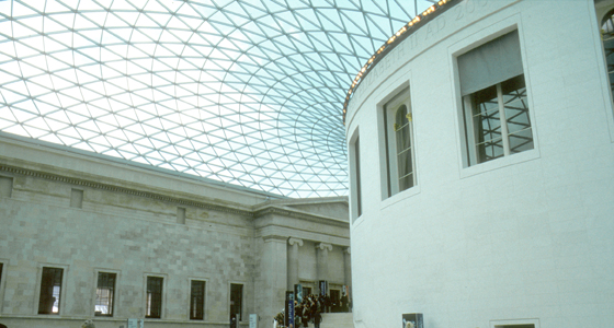
After the British Library moved to St Pancras in 1997 building work began here to transform the area around the former Reading Room. Norman Foster’s scheme enclosed the brick Reading Room in stone to match the surrounding buildings [note The main parts of the museum were designed by Sir Robert Smirke between 1823–47. The domed Reading Room was the work of his brother Sidney and was finished in 1857.] and the whole area was roofed with a geodesic-like glazed roof. From afar it looks as though a bouncy castle is on the roof, from inside, as though you’re walking through a computer—generated image. The lighting is flat, slightly blue and the sound, when full of schoolchildren, is like a swimming pool. The sense of space which was, on opening, impressive, has since been largely nullified by a plethora of direction boards and two information desks.
The drum of the Reading Room is surmounted by an inscription saying when and why, while lower down, sponsors’ names cover the surface. A quote from Tennyson is set in the floor. Compared to the quality of Michael Harvey’s work at the National Gallery this is a real disappointment, the letterforms are virtually the typeface Rotis, Foster’s corporate face. At the upper level it has a shallow square-cut section and is set too high in the space. The sponsors’ names in upper & lower-case are spaced for pattern-making rather than readability. None of it feels as though it were done by someone who really loved lettering or the effects of light and shadow and scale.
Details list – click to switch the current detail
Click to download the original image.
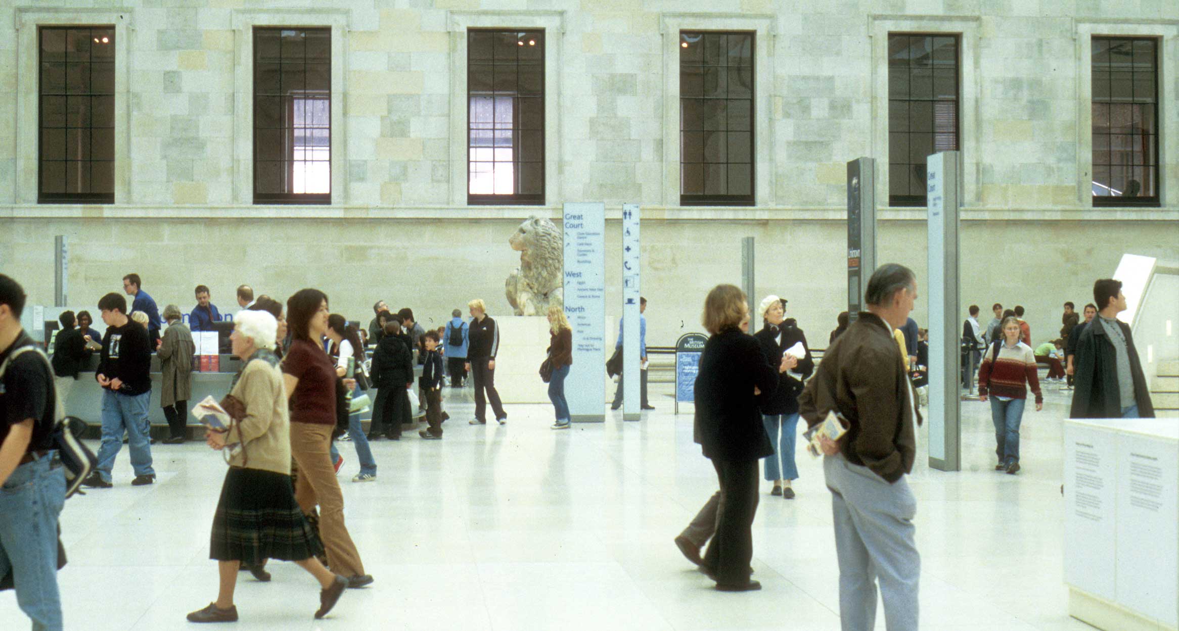
Having created this space the museum is rapidly filling it up.
Click to download the original image.
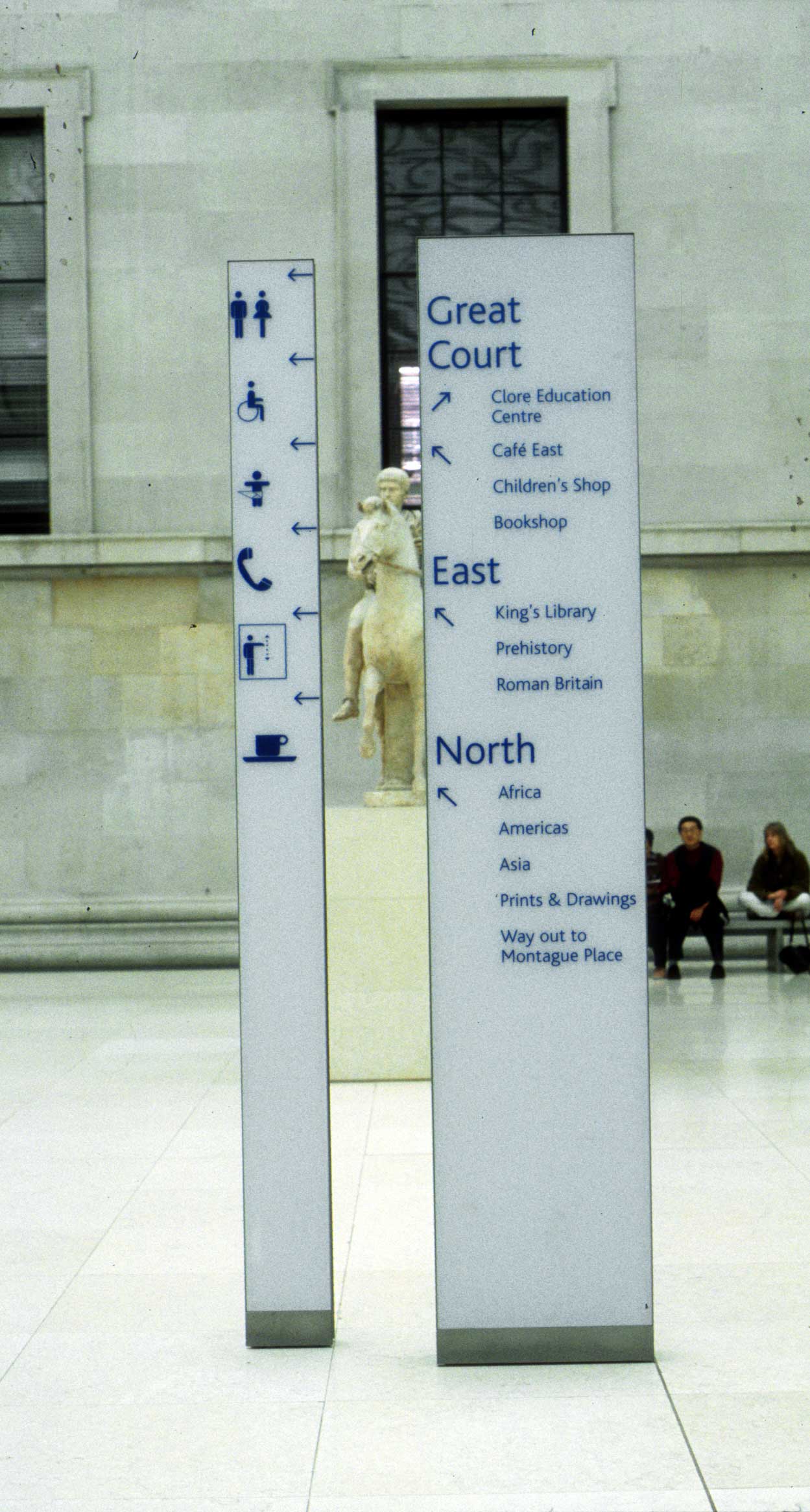
In addition to the quantity of these signs some of the pictograms are far from clear. What does a person waving an arm up and down mean?
Click to download the original image.

This lettering is too high in its place: when the lights are on it can be difficult to see.
Click to download the original image.
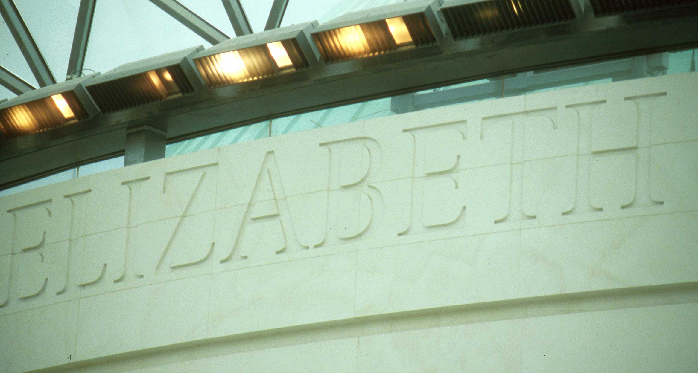
This lettering is too high in its place: when the lights are on it can be difficult to see.
Click to download the original image.
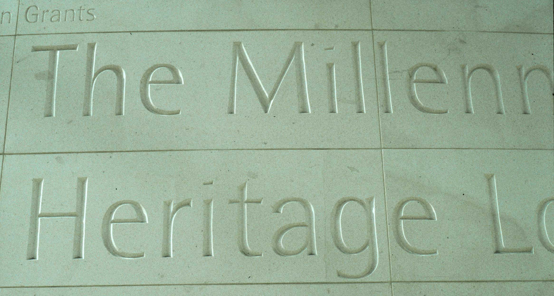
Thin letters, a shallow v-cut, generous spacing: it doesn’t look like anyone meant it.
Click to download the original image.
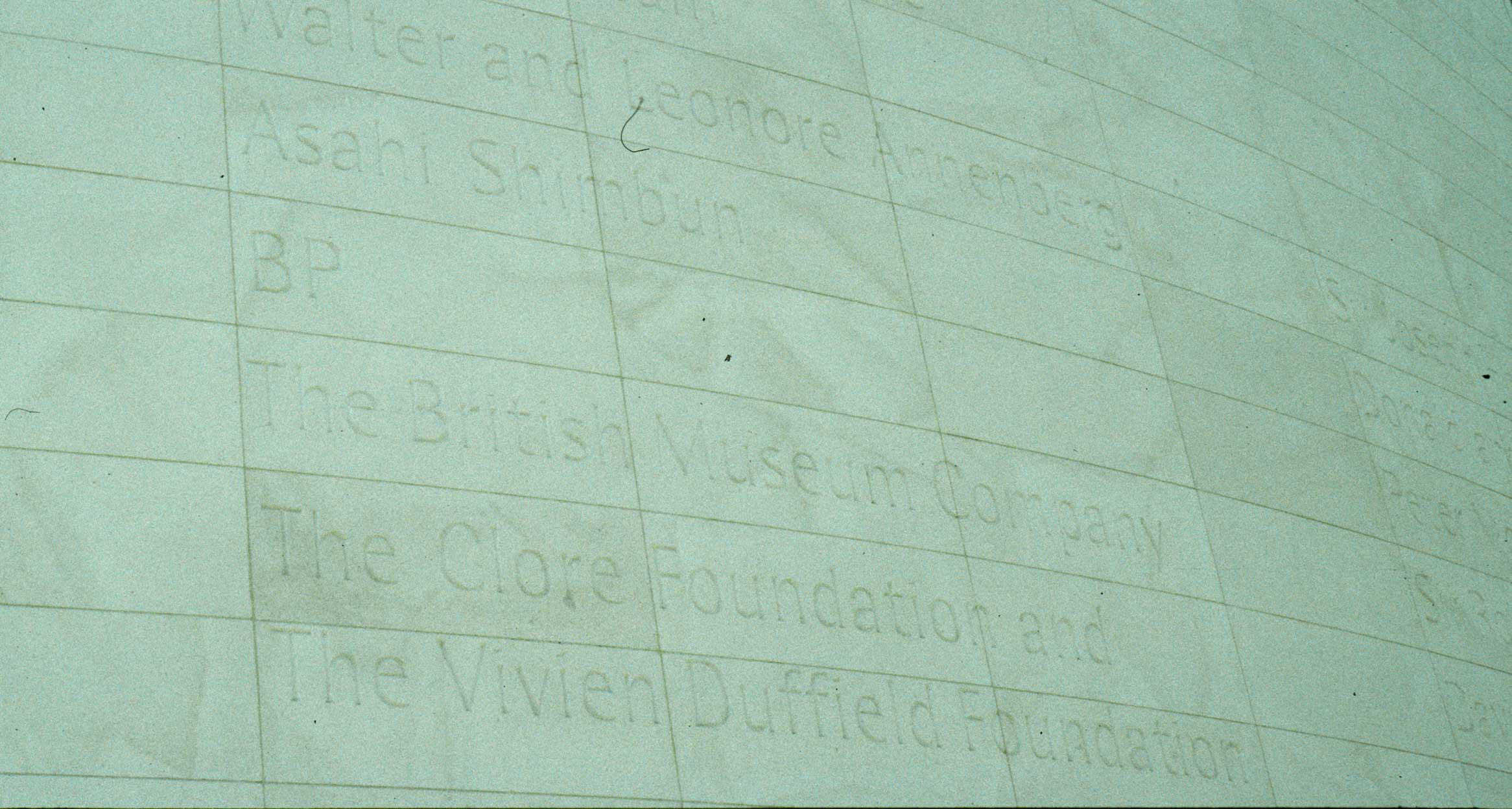
Depending on the light conditions these names are often invisible until you get close.
Click to download the original image.
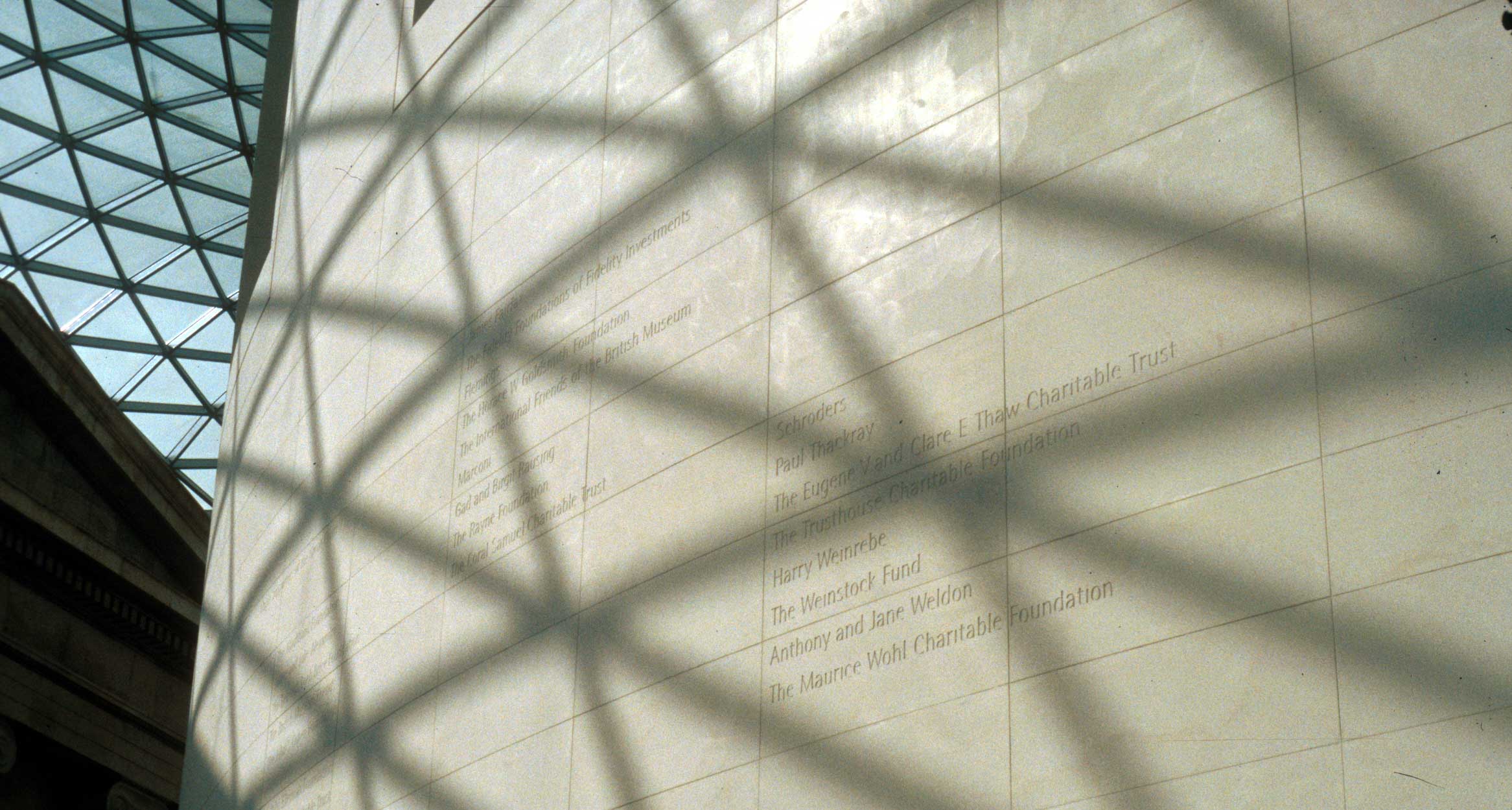
Depending on the light conditions these names are often invisible until you get close.