
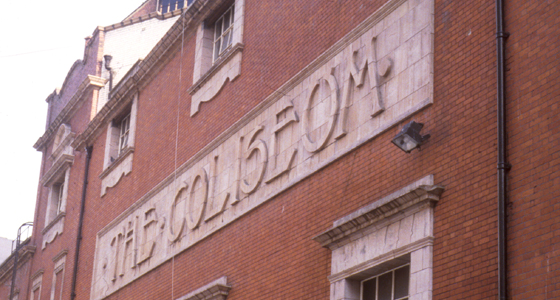
The Coliseum May’s Court, off Bedfordbury
A glorious example of lettering proclaiming the name of a building on the side rather than the front of the building. Presumably this was because the front of the theatre would be covered in an ever-changing display of publicity for the performances themselves. The letters, formed out of three courses of terracotta blocks, are ‘curvilinear’ in style, typical of 1904 when the theatre was built and similar to the tiled lettering on the Leslie Green underground stations previously referred to.
At the time of writing (April 2002) this façade is invisible under a shroud of scaffold and plastic. This is part of English National Opera’s £41 million restoration and improvement of the whole building which is due to be complete for its centenary year.
Details list – click to switch the current detail
A contemporary comparison
Click to download the original image.

Other theatres and cinemas featured carved ‘permament’ lettering on a side street. This cinema (now a bar) is in Shepherds’ Bush.
Click to download the original image.

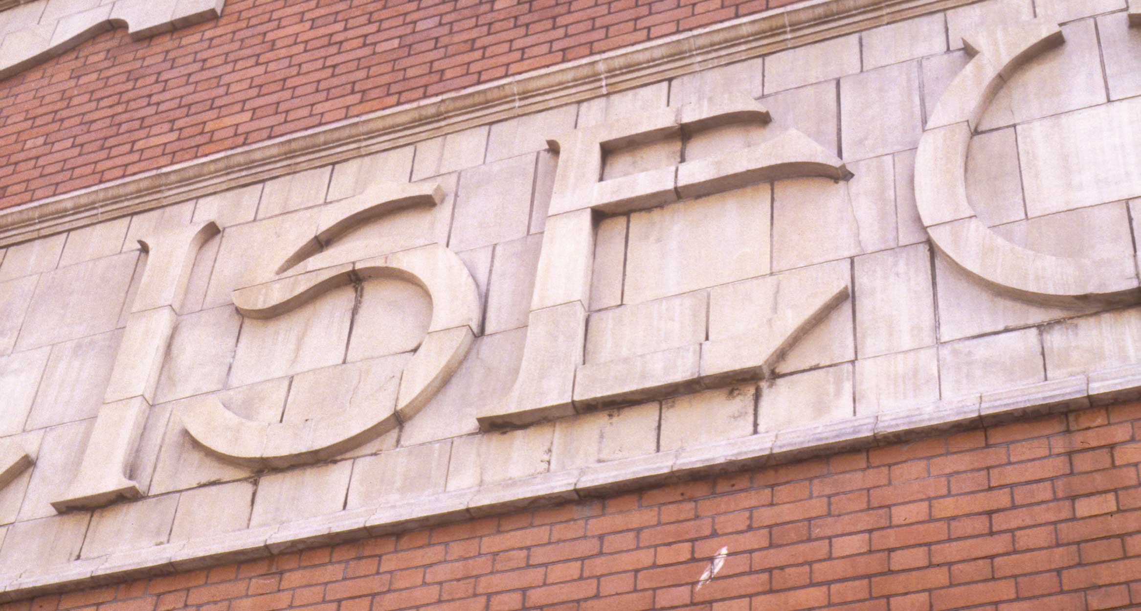
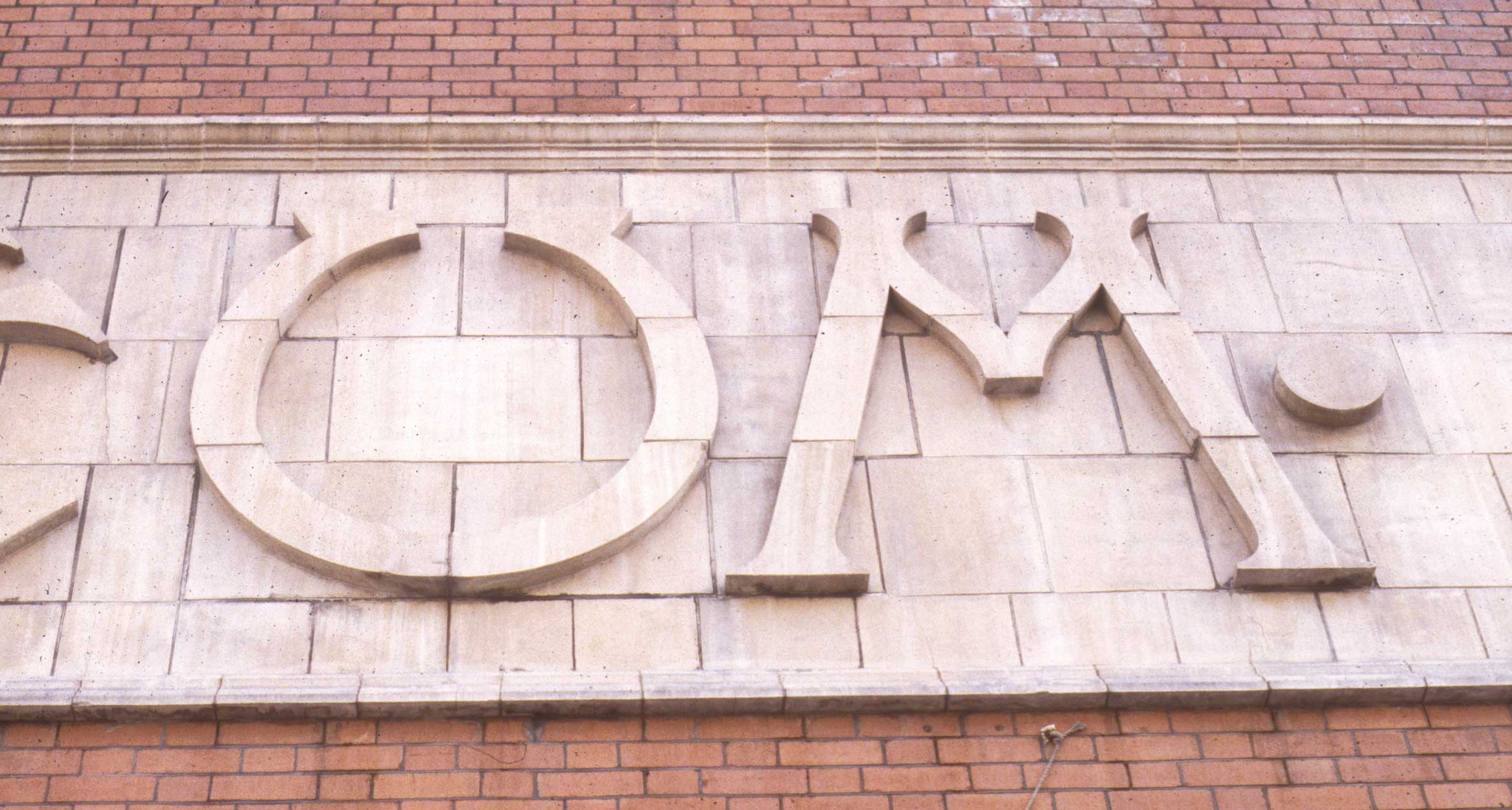
It’s hard to believe that for a time in the 1970s this lettering was threatened with replacement with an illuminated sign.
Click to download the original image.
It’s hard to believe that for a time in the 1970s this lettering was threatened with replacement with an illuminated sign.
Click to download the original image.
It’s hard to believe that for a time in the 1970s this lettering was threatened with replacement with an illuminated sign.
Close up
Click to download the original image.

Given the width of May’s Court, photography of this lettering is difficult. The photographer stood on top of a telephone box for these details.