
Lettering – as understood by calligraphers or stone carvers – is not part of most undergraduate graphic design or typography programmes. This and the ability of computers and contemporary production methods to generate type at any size on virtually any substrate tends to blind us to the subtle but important differences between lettering and type and to the needs of permanent or semi–permanent display in an environmental context as distinct from the needs of print on paper or screen.
A definition of typography we use in our teaching is that ‘typography is the mechanical notation and arrangement of language’.[note Phil Baines & Andrew Haslam, Type & typography, Laurence King 2002, pp.7–9.] Implicit in this definition is the idea of duplication and automation. In order to work efficiently, the design of typefaces has always been concerned with far more than just the shape of the forms. It must include the in–built spacing requirements for each character (which includes the provision of kerned pairs as appropriate), and must address the production aspects which today implies some form of rendering engine. (Type Design: 1 & 2) Another particular characteristic of typefaces is that they are commodities licensed to other users. Type designers are therefore designing for a wide range of circumstances about which they may know little, still less, exercise control.
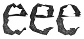
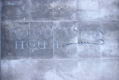
Type Design, images 1 & 2.

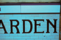
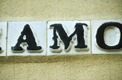
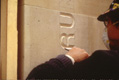
If type is regarded as an industrial product capable of widespread use, lettering can be regarded as its parent discipline. It encompasses all the various hand techniques used to render the alphabetic symbols mankind has used for thousands of years to identify, to instruct and to present or promote.[note See Richard Hollis’s discussion about the functions of graphic design in Graphic design: a concise history, Thames & Hudson 1994, p.10.] Lettering as a discipline is concerned with both the creation and utilisation of letterforms. The letterforms created demonstrate a capacity for formal flexibility which differs from the flexibility inherent in most types: within a single example of lettering, individual letterforms may be repeated or distinct, and their spatial relationships to other characters may vary according to context. It is this essential awareness of the context and the methods of production of a given piece of lettering which are exploited by the lettering artist. The degree to which this is exploited varies: at one extreme may be a concern for utility while at the other is expression.[note These two poles are identified and extensively explored within the writings of Nicolete Gray who pioneered the study of the ‘art’ of lettering: see especially Lettering on buildings, Architectural Press 1960 and A history of lettering, Phaidon 1986.] Variations in the relative balance of these essential elements of utility and creativity are here explored using examples from two particular aspects of architectural/environmental lettering practice: lettering which relies upon a manufacturing process and in which the medium and surface generate the visual interest (Modularity & manufacture: 3–9), and lettering which is hand–produced and in which both the medium and the letterforms themselves generate the visual interest (Exploration: 10–15).
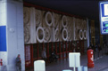
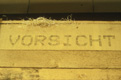
Modularity & manufacture, images 3 - 9.


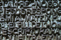
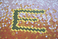
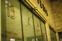
Exploration, images 10 - 15.


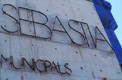
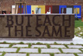
What becomes clear when looking at these architectural/environmental examples is that the criteria for assessing lettering cannot be limited to a consideration of the letterforms alone. It is a relationship of four main factors – letterform, placement or situation, scale and material – with the dominant influence varying from one example to the next. Situation, scale and material can all dictate the forms of the letters themselves (Form dictated by material: 16 & 17) giving them an unexpected beauty. Conversely, if ill–considered, these factors will diminish any value the letterforms may have in isolation (Integration of form, material and position. 1: 18 & 19). What is also true, is that there is certainly no single style of letter which works for all occasions (Local vernacular traditions: 20). Poor – or simply quite ordinary – letterforms can also be transformed by scale or colour or situation (Form redeemed by material: 21–23). The considerable and hugely under–valued skill of the lettering artist lies in this ability to balance the impact of each of these factors in relation to the whole for each individual commission. Ironically, it is often the success of commissions sensibly and sensitively managed that renders such skill invisible (Integration of form, material and position. 2: 24–30). Unaware of the need for informed application and adjustment, the uninitiated wrongly assume that typeforms, as letters, can simply be transferred from one field into another (Type enlarged: 31 & 32).
Form dictated by material, images 16 & 17.
Integration of form, material and position. 1, images 18 & 19.
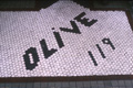
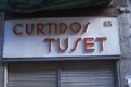
Local vernacular traditions, image 20.

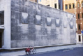
Form redeemed by material, images 21 - 23.


Integration of form, material and position. 2, images 24 - 30.


Type enlarged, images 31 & 32.

There is so much that is uninspiring and unsuccessful in lettering terms that it is all to easy to become used to bad practice and simply accept it. And yet, recent examples which serve to visually enrich our experience of letterforms and the environment in which they are located (Integration of form, material and position. 3: 33 & 34), also serve to remind us that there is significant value in recognising – and teaching – the difference between lettering and type.
Phil Baines & Catherine Dixon
Integration of form, material and position. 3, images 33 & 34.

Phil Baines & Catherine Dixon Copyright © 2002
All images by the authors except: 1, Jeremy Tankard; 11, Central Lettering Record at Central Saint Martins College of Art & Design; and 31, Graven Images.