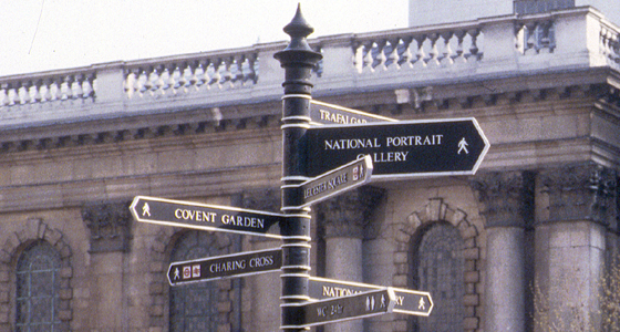
Pedestrian signage traffic island at junction of Charing Cross Road
There is provision in the road sign legislation for pedestrian signs. Despite their efficacy, the conservation lobby and sign manufacturers seem to have got these finger-posts accepted by local authorities as acceptable substitutes for pedestrian signage. Am I being irrational or are these a waste of time and money? Everything about them is apologetic. As objects they are weak, the detailing is badly-observed and generally too small. As signs they do not work: the capitals are ‘set’ too tightly for reading across a wide road.
Details list – click to switch the current detail
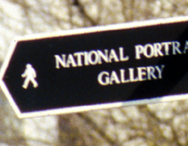
Close up of type
Click to download the original image.

These signs would be far more legible if the capital letters were spaced a little. The border is also visually too heavy and close to them.
Other styles of pedestrian signs
Click to download the original image.

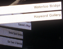
Elegance on the London’s South Bank. Clear (but unadventurous) type panels mounted on a flared stainless steel pole reminiscent of the Festival of Britain’s Skylon which stood nearby.
